
My friend makes dining chairs. Really good ones. Strong wood. Made by hand. Built to last 20 years. He sells them for about ₹18,000 each.
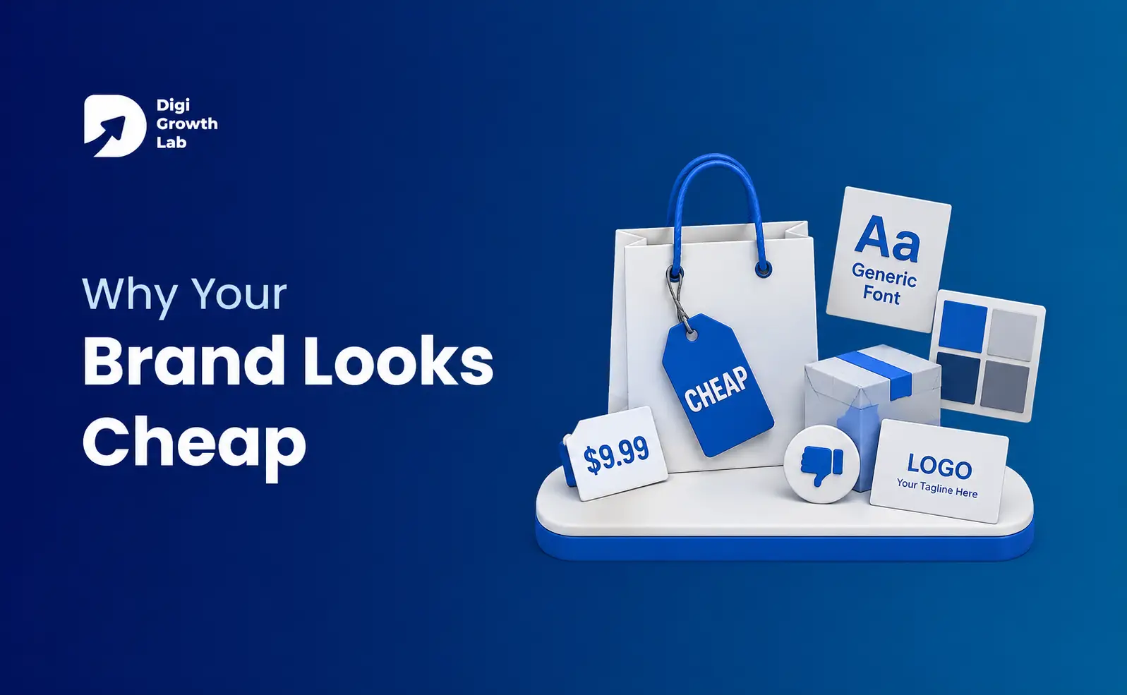
But his brand looked cheap. Like it sold ₹4,000 chairs.
The photos were bad – shot on a phone in a messy garage. The logo looked rushed. The website used too many fonts. The box was plain, with a crooked label.
The chairs were great. But people couldn’t see that. They took one look, thought “too expensive,” and left.
This is the problem. Your product may be great. But if your brand looks cheap, people trust what they see – not the product. And they decide fast. Studies show people judge a website in less than a second. In that moment, they think “this looks good” or “this looks cheap.” After that, it’s hard to change their mind.
So let’s fix it. No confusing advice. Just the common mistakes, and how to fix them.
Why Great Products Often Look Cheap
You’d think a great product would look great. It usually doesn’t. Here’s why.
When you make something good, you focus on the product – the wood, the recipe, the code. The branding feels like extra stuff to do “later.” So the logo, box, and website get done last, done fast, or done by whoever is free.
But your customer sees it in the opposite order. They see the box before the product. The website before the service. The photos before the quality.
There’s a name for this: the halo effect. It means one thing people see shapes how they judge everything else. If your box looks cheap, people assume the product is cheap too – even when it’s not. It works the other way as well. A nice box makes people expect more, and they often feel the product is better.
Same product. Different look. Different judgment.
Why People Judge You So Fast
You don’t need to study psychology. But a few simple things happen in your customer’s head. Knowing them helps.
Perceived value. This is what someone thinks your product is worth before trying it. People don’t pay for quality. They pay for the quality they can see. If they can’t see it, it doesn’t count yet.
Price tells them quality. When people can’t judge quality easily, they use price as a clue. Higher price feels like higher quality. So if you look cheap, people assume the product is cheap too – then look for reasons to prove it.
Easy feels trustworthy. Clean layouts and readable fonts feel more trustworthy, simply because the brain isn’t working hard. A messy, confusing brand feels less reliable.
First impressions stick. Once someone decides you look cheap, they look for proof they’re right and ignore proof they’re wrong. A bad first impression puts you behind from the start.
Notice the pattern? None of this is about how good you actually are. It’s about how good you look before anyone finds out.
Your Look Controls Your Price
Here’s where it becomes about money.
The way you look sets a limit on what you can charge. Not your real quality – your perceived quality. If your brand looks cheap, any price above “cheap” feels too high to the customer. So you get stuck competing on price and cutting your profit.
The numbers back this up. PwC surveyed 15,000 people (2018) and found they’ll pay up to 16% more for a better experience. And one in three will leave a brand they love after just one bad experience. Companies with consistent branding saw revenue go up by as much as 33% (Lucidpress/Marq, 2019).
Think about Rolex. They almost never talk about how the watch works. They sell status and trust, and let the product stay quiet. They can do that because the brand looks valuable before you read a word.
Cheap Brand vs Premium Brand
None of these differences are about spending more money. They’re about making clear choices.
| ❌ Cheap-Looking Brand | ✅ Premium-Feeling Brand |
|---|---|
| Random fonts | Two fonts, used consistently everywhere |
| Colors change on every platform | One consistent color palette |
| Phone photos with poor lighting | Clean, professional, well-lit photos |
| Everything crammed together | Uses whitespace and feels calm |
| Shouts “SALE!” and “BUY NOW!” | Speaks with confidence and clarity |
| Looks different on every channel | Maintains the same identity everywhere |
| Talks only about itself | Focuses on the customer’s needs |
| Hopes you’ll trust it | Earns trust with proof, reviews, and results |
If your brand is mostly in the left column, that’s not a money problem. It’s a choices problem. And choices are free.
The 12 Signs Your Brand Looks Cheap
Quick check. If a few of these sound like you, you’ve found the problem.
Quick Brand Audit Checklist
If you checked three or more of these, your brand may be looking cheaper than it should.
- ☐ Too many fonts
- ☐ Too many colors with no clear brand guidelines
- ☐ A blurry or stretched logo
- ☐ A generic template website
- ☐ Low-quality product photos
- ☐ Plain or flimsy packaging
- ☐ No reviews or customer testimonials
- ☐ No guarantees, certifications, or trust badges
- ☐ A social media feed with inconsistent designs
- ☐ Website copy that sounds robotic or generic
- ☐ Obvious stock photos of fake happy people
- ☐ No unique brand personality
Logo, Font, and Color Mistakes That Look Cheap
Your logo is not your brand. People obsess over the logo, but it’s a small part of the whole. Nike’s logo is just a tick. Apple’s is just an apple. They feel premium because of everything around them, not the logo itself.
Where logos actually go wrong: they’re blurry, stretched, on a busy background, or used in five slightly different versions because no one has the real file.
Fonts. Too many fonts make a brand look cheap. Premium brands pick one or two and use them everywhere. Not seven. Two. Clean, easy-to-read fonts make people trust you more, even if they don’t know why.
Colors. Cheap brands use too many colors, or a different set on every platform. It looks messy, and messy looks disorganized. Premium brands pick a small set of colors and stick to them.
Bad Product Photos Are Killing Your Sales
If you sell physical products, your photos are your product to most people. They won’t touch it until after they buy. So the photo does all the work.
Cheap photo signs: harsh lighting, messy backgrounds, and different angles and sizes for each product. Compare that to how Apple or Dyson shoot – clean background, soft lighting, the product treated like it matters.
You don’t need an expensive studio. You need soft, even light, a clean background, and the same setup for every photo.
Your Packaging Is the First Thing People Judge
The box is the first thing a customer holds. And they judge it.
Cheap packaging signs: flimsy materials, labels crammed with text, and a box that clearly got no thought. Too much text and too many badges make it look cheap. Space makes it look confident.
You don’t need luxury materials. Muji uses plain, simple packaging and still feels premium, because every choice looks deliberate.
| 📦 Cheap Packaging | ✨ Premium Packaging |
|---|---|
| Thin, flimsy materials | Sturdy materials that feel good to hold |
| Label crammed with text | Clean, well-spaced label with clear hierarchy |
| Designed only for shipping | Creates a memorable unboxing experience |
| Looks generic and forgettable | Distinctive branding that’s instantly recognizable |
Your Website Decides If People Trust You
Most first impressions happen on your website. And design matters more than people think. Stanford research (2002) found that when people judge if a business is trustworthy, the biggest factor was the website’s design – chosen by about 46% of people, more than the actual content.
Cheap website signs: slow loading, a template everyone recognizes, walls of text, low-quality images, a bad mobile experience, and no clear next step.
| ❌ Weak Website | ✅ Strong Website |
|---|---|
| Slow loading and not mobile-friendly | Fast loading and works perfectly on all devices |
| Uses a generic website template | Custom design that reflects the brand |
| Everything competes for attention | Clean layout with a clear visual hierarchy |
| Fake or overused stock photos | Authentic team, office, or product photos |
| No clear call-to-action | One obvious next step for visitors |
| No reviews, testimonials, or proof | Trust signals placed where they matter most |
The good news: this is the easiest thing to fix, because you control it.
A Messy Social Feed Makes You Look Small
Your Social Media feed is often the first place a stranger meets you. A cheap-looking feed ruins everything else.
The usual mess: every post looks different, mismatched fonts and filters, blurry reposts, and a bio that doesn’t say what you do. A feed like that looks like a hobby, not a business.
Good feeds aren’t fancier. They’re consistent. Same colors, same style, same tone, every post.
Weak Words Make a Brand Feel Cheap
Words are branding too. Weak words make a brand feel cheap fast. The signs: boring filler, stiff corporate language, bragging about yourself, and typos.
| ❌ Bad Copy | ✅ Good Copy |
|---|---|
| “We are a leading provider of quality solutions.” | “We make chairs you’ll love for twenty years.” |
| “Buy now!” | “Try it for 30 days. Send it back if it’s not for you.” |
| “Our product has many features.” | “Charges in 20 minutes. Lasts all day.” |
| “Contact us for more information.” | “Have a question? A real person replies within a day.” |
Good copy is simple, human, and about the customer. Bad copy is vague, stiff, and about you.
Give People Reasons to Trust You
People are careful online. If your brand gives them nothing to lean on, “looks cheap” becomes “feels risky.”
Trust signals are simple proofs that you’re real: reviews and testimonials, guarantees and return policies, security badges at checkout, real contact details, and real photos of real people. Missing these makes you look small.
Being Inconsistent Is What Hurts You Most
If I could fix only one thing, it would be this. Being inconsistent is the number-one reason good businesses look cheap. And most people don’t notice they’re doing it.
Here’s what it looks like: your logo is blue on the site and teal on Instagram. Your homepage uses one font, your emails another. Your tone is fun on social but stiff on the website. Each mismatch is small. Together, they make it look like several different people made your brand with no plan.
Consistency is what separates premium brands from the rest. It’s not about better taste. It’s about picking rules and following them everywhere. That’s why consistent brands earn more.
You Don’t Have to Look Luxury to Look Good
Quick point, because people mix this up. You don’t have to look luxury to stop looking cheap.
IKEA isn’t luxury. It’s cheap furniture. But its brand is so clear and consistent that it feels trustworthy, not cheap. That’s the goal for most businesses – not “luxury,” just “not cheap.”
Also, “expensive-looking” is a trap. Adding black and gold to everything doesn’t make you premium. It usually makes you look like you’re trying to look premium, which feels cheaper. Real premium is often simple and calm.
Look at how the best brands do it:
- Apple – lots of space, simple fonts, clean photos, everything matches.
- Muji – plain and minimal, but every choice looks deliberate.
- IKEA – same colors and voice everywhere, so it never looks messy.
- Rolex – sells status, not specs, because the brand already looks valuable.
Different prices, different styles. But they all have one thing in common: each one looks the same everywhere, on purpose.
Your Step-by-Step Plan
Do these in order, starting with the fastest wins.
- Fix what people see first. List everything a customer sees before buying – profile, homepage, photo, box. Fix these first.
- Make a brand sheet. Two fonts, one set of colors, proper logo files, a few notes on tone.
- Fix your photos. Soft window light, clean background, same setup every time.
- Clean up your website. Fast, works on mobile, one clear button per page.
- Add trust signals. Reviews, a guarantee, real contact info.
- Fix your words. Homepage and product pages. Simple, human, about the customer.
- Make everything match. Check every channel against your brand sheet.
- Upgrade one physical touch. A better box, a sticker, a thank-you card.
Do these and you’ll look like a more valuable business within weeks – without changing your product at all.
The Checklist to Save and Reuse
Check it once every few months. Every box you can’t tick is a leak.
✔ Premium Brand Checklist
Use this quick checklist to see whether your brand gives customers a premium first impression.
- ☐ Logo is high-quality and used consistently everywhere
- ☐ Only one or two fonts across all materials
- ☐ A consistent, limited color palette
- ☐ Website loads quickly and works perfectly on mobile
- ☐ Every page has one clear call-to-action
- ☐ Product photos are clean, professional, and consistent
- ☐ Packaging looks intentional and premium
- ☐ Customer reviews and testimonials are easy to find
- ☐ Trust badges, guarantees, or certifications are visible
- ☐ Social media posts follow the same visual style
- ☐ Website copy sounds natural and human
- ☐ No low-quality or fake-looking stock photos
- ☐ Every customer touchpoint feels consistent
✔ 11–13 checks: Your brand already feels premium.
✔ 8–10 checks: You’re on the right path, but consistency needs work.
✔ Below 8: Your branding may be costing you trust and sales.
The Bottom Line
Your product might be worth every rupee. But people can’t try it before they judge you. They judge the brand – in less than a second. If the brand looks cheap, the great product never gets a fair chance.
The fix isn’t a big budget or a luxury makeover. It’s the simple stuff: fix what people see first, pick your rules, stay consistent, and give people reasons to trust you.
My friend didn’t change the chairs. He changed the photos, cleaned up the website, fixed the packaging, and made everything match. A few months later, his ₹18,000 chairs finally looked like ₹18,000 chairs. The “too expensive” messages stopped. And he stopped apologizing for his prices.
Same chairs. Different story. That’s all branding is.
Does Your Brand Look Cheaper Than It Should?
A cheap looking brand makes people leave before they see how good your product is.
Frequently Asked Questions
Why does my brand look cheap even though my product is good?
Because customers meet your brand before your product, and they judge it in about 50 milliseconds. If your visuals, packaging, or website look low-effort, the halo effect makes people assume the product is low-quality too -before they ever try it.
What makes a brand look expensive?
Consistency and restraint, mostly. One or two fonts, a tight color palette, clean photography, plenty of space, and the same look across every channel. Expensive-looking brands aren’t more decorated -they’re more disciplined.
Does a better logo fix a cheap-looking brand?
No. A logo is a small piece of the system. You can have a beautiful logo and still look cheap if your photos, website, copy, and packaging are inconsistent. Fix the whole system, not just the mark.
How much does it cost to make a brand look more premium?
Less than you’d think. The highest-impact fixes -a consistent color/font system, better-lit photos, cleaner copy, added trust signals, and consistency across channels -cost time more than money. You rarely need a full luxury rebrand.
Can I look premium without being a luxury brand?
Yes. IKEA, Muji, and The Ordinary all look intentional and trustworthy without being luxury. “Not cheap-looking” comes from consistency and clarity, which any brand at any price can achieve.
What’s the single biggest reason brands look cheap?
Inconsistency. Different colors, fonts, and tone across your website, social, and packaging make a business look like several small, disorganized operations instead of one confident brand.